SUMMARY
This is AI generated summarization, which may have errors. For context, always refer to the full article.
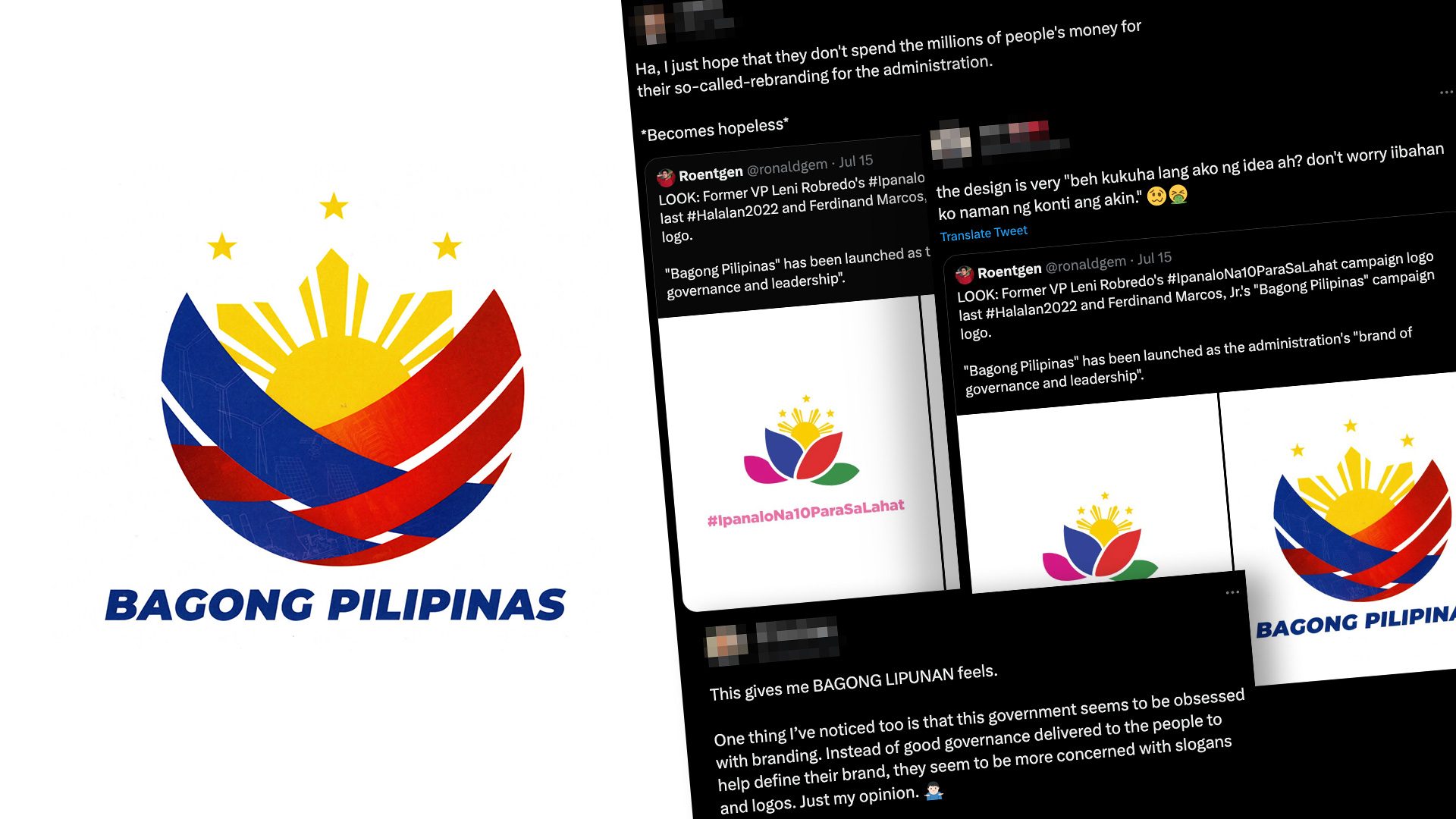
MANILA, Philippines – Just days after another rebranding gone awry, several social media users threw jabs at the approved logo for the Marcos administration’s new brand for governance and leadership.
“Bagong Pilipinas” (New Philippines) – which was also President Ferdinand Marcos Jr.’s trademark slogan during the 2022 national elections – is a campaign “characterized by a principled, accountable and dependable government reinforced by unified institutions of society,” according to a memorandum released by the Office of the President on Monday, July 3.
All national government agencies and institutions are required to incorporate the new logo in their letterheads, websites, social media accounts, and other official documents, the document also said.
With people still recovering from Pagcor’s recent logo fiasco, a rebrand which cost P3 million, some netizens could not help but wonder how much the Marcos administration paid for its new branding.
Unoriginal?
Meanwhile, some individuals pointed out that the logo resembled one of the symbols used during former Vice President Leni Robredo’s presidential campaign for the 2022 polls.
Other social media users also said that the slogan reminded them of “Bagong Lipunan” (New Society), the branding used by his father, the late dictator Ferdinand E. Marcos . “Bagong Lipunan” was launched in 1973, a few months after start of the authoritarian Marcos rule with the declaration of martial law.
“Bagong Lipunan” was also a song popularized during those dark years, and was said to be played while activists were tortured and farmers were killed.
Reforms, not rebrands
Netizens urged the Marcos administration to focus on addressing urgent issues, such as inflation, poverty, and corruption, instead of changing its branding.
The “Bagong Pilipinas” brand was launched over a year after the chief executive was sworn into office on June 30, 2022. Since then, Marcos has promised to bring down the price of rice, bring medical services to the people, among others.
What do you think of the new logo? –Rappler.com
1 comment
How does this make you feel?


![[OPINION] A political earthquake? Sara Duterte fails to seize narrative](https://www.rappler.com/tachyon/2024/06/thought-leaders-political-earthquake.jpg?resize=257%2C257&crop_strategy=attention)
![[WATCH] In the Public Square with John Nery: The Marcoses’ three-body problem](https://www.rappler.com/tachyon/2024/04/pubsq-sq.jpg?resize=257%2C257&crop=390px%2C0px%2C1080px%2C1080px)
![[Newsstand] The Marcoses’ three-body problem](https://www.rappler.com/tachyon/2024/04/tl-marcoses-3-body-problem.jpg?resize=257%2C257&crop=451px%2C0px%2C1080px%2C1080px)
![[EDITORIAL] Kalaban mo ang mga senador na protektor ni Quiboloy](https://www.rappler.com/tachyon/2024/03/animated-quiboloy-kojc-senate-carousel.jpg?resize=257%2C257&crop=365px%2C0px%2C720px%2C720px)
![[WATCH] The new Negros Island Region: What’s it about?](https://www.rappler.com/tachyon/2024/06/new-negros-island-region-ls.jpg?resize=257%2C257&crop=421px%2C0px%2C1080px%2C1080px)


![[ANALYSIS] Danger signs in an oligarchy: Political violence and intrigue](https://www.rappler.com/tachyon/2023/08/oligarchy-duterte-marcos-july-30-2023.jpg?resize=257%2C257&crop_strategy=attention)


This is what I think of the new “Bagong Pilipinas” logo. First, there are Two Blue Ribbons, each one representing: 1) PBBM (some said he is really the First Gentleman), 2) FL Liza Araneta Marcos (some people said she is really the Real President). These ribbons have faint images of power facilities, which means that they are the ones in power now. Secondly, there are three Red Ribbons, each one representing: 1) Sara Duterte, 2) Gloria Arroyo, and 3) Imee Marcos. They have faint images of “Buildings under Construction”, which means that they will be the Center of Power after PBBM (unless Sara Duterte will be defeated during the 2028 Presidential Election). Third and lastly, the “the lower half of the sun is partly covered by blue and red ribbons”
– representing how the Marcos-Duterte Disinformation Machinery
is engulfing the People’s Mind and how their massive yet discreet
Corruption Machinery is captivating the People’s economic life.